/* MOBILE FIX: stop forcing desktop min-width */ @media screen and (max-width: 800px) { body { min-width: 0 !important; } .content-outer, .content-fauxcolumn-outer, .region-inner { min-width: 0 !important; max-width: 100% !important; width: auto !important; } .main-inner .columns { padding-left: 0 !important; padding-right: 0 !important; } } .date-header { background: #000 !important; display: block !important; width: 100% !important; padding: 8px 12px !important; box-sizing: border-box !important; } .date-header span { background: transparent !important; } .post-header-line-1 { display: block !important; width: 100% !important; background: #000 !important; padding: 8px 12px !important; box-sizing: border-box !important; } .post-header-line-1 * { background: transparent !important; } /* --- XMastime fixes: titles + date bars + mobile --- */ /* Post titles: stop random centering */ h3.post-title, h2.post-title, .post-title { text-align: left !important; } /* Date header: make the black bar extend full width */ .post-header-line-1 { display: block !important; width: 100% !important; background: #000 !important; padding: 8px 12px !important; box-sizing: border-box !important; } .post-header-line-1 * { background: transparent !important; text-align: left !important; } /* Mobile: stop forcing huge desktop width */ @media screen and (max-width: 800px) { body { min-width: 0 !important; } .content-outer, .content-fauxcolumn-outer, .region-inner { min-width: 0 !important; max-width: 100% !important; width: auto !important; } .main-inner .columns { padding-left: 0 !important; padding-right: 0 !important; } } /* FORCE post titles consistent */ .post-title, .post-title a, h2.post-title, h3.post-title { text-align: left !important; } /* FORCE full-width date bar across common Blogger structures */ .date-header, .date-header span, .post-header, .post-header-line-1, .post-header-line-1 span, .post-outer .post-header-line-1, .post-outer .post-header, .blog-posts .post-header-line-1 { display: block !important; width: 100% !important; background: #000 !important; box-sizing: border-box !important; padding: 8px 12px !important; margin: 0 !important; } /* prevent inner bits from “breaking” the bar */ .date-header *, .post-header *, .post-header-line-1 * { background: transparent !important; text-align: left !important; } /* MOBILE: stop the fixed 1218px width behavior */ @media screen and (max-width: 800px) { body, .content-outer, .content-fauxcolumn-outer, .region-inner { min-width: 0 !important; max-width: 100% !important; width: auto !important; } .main-inner .columns { padding-left: 0 !important; padding-right: 0 !important; } } /* DATE HEADER: make the black bar go full width */ .date-outer, /* FORCE FULL WIDTH DATE BAR NO MATTER WHAT */ .date-outer, .date-posts, .date-posts h2, .date-posts h3, .date-header, h2.date-header, h3.date-header { display: block !important; width: 100% !important; background: #000 !important; padding: 10px 12px !important; box-sizing: border-box !important; margin: 0 0 18px 0 !important; } /* force the TEXT itself orange and remove any weird inner box */ .date-posts span, .date-header span, .date-posts h2 span, .date-posts h3 span { background: transparent !important; color: #ff6600 !important; display: block !important; width: 100% !important; } -->

Sunday, May 13, 2012

Happy Mother's Day!

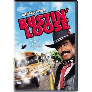
Stopped in my tracks while flipping thanks to yet another in their roster of "are you shitting me?" smoking hot chicks, I just landed on FOX News' Fox and Friends or whatever it is, and they were talking about movies to enjoy with mom on Mother's Day, and they discussed gay shit like The Blind Side and My Big Fat Greek Wedding.  I doubt my mother would like either one of those cheesefests; the hardest I ever saw her laugh at a movie was Bustin' Loose when it came on tv out of nowhere one weekday night.


No comments: